|

|
 |
| |
It requires some effort and experience to recognize the typical characteristics of traditional colors and how they fade. Comparing multiple
impressions of the same design, different prints by the same artist or within the same period, and works of widely separate periods all help to
educate the observer and train the eye. We can benefit particularly from the examination of the same design in different states of preservation.
One must exercise caution, however, because there was variability in the application of colorants across different sheets, even within the same edition.
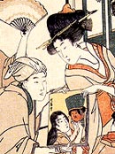
A typical example of substantial fading is shown immediately below on the right, where the purple, red, and orange pigmanents have been compromised dramatically. Both impressions featuring the actor Sawamura Sôjûrô III by the artist Katsukawa Shunei are from the 1790s. The one on the left was stored out of natural or artificial light for most of its existence, revealing only a hint of color change along the edge of the right sleeve and some of the lower part of the robe. For more examples of gradual color fading, see Red Colorants in Ukiyo-e Prints.

Katsukawa Shunei
Sawamura Sôjûrô III (1790s)
(Very good colors) |

Katsukawa Shunei
Sawamura Sôjûrô III (1790s)
(Faded colors) |
Sometimes prints show a color whose state of preservation varies quite noticeably over the same sheet, due to unequal exposure to light or humidity. These examples are especially helpful because we have, in effect, a more "controlled experiment" in which the colorant was fairly uniform when first applied (assuming it was not applied through gradation printing). We may not always know whether the less faded portion represents a pristine state, but even if it does not, the specimen provides information about the stages of fading for that particular colorant.
Recent Findings on Aigami (Dayflower Blue)
It has long been thought that aigami or the organic dye produced from the hybridized dayflower (Commelina communis L. var. hortensis Makino) was exceedingly fugitive when exposed to light. Recent research indicates that the colorant is only moderately sensitive to light. However, it is extremely fugitive when exposed to moisture (this would include not only direct contact with liquids but also humidity). Furthermore, the unfaded appearance of the colorant may range from warm bright blue to grayish blue depending on the length of time it has been stored in the paper carrier (the traditional form of aigami is produced as pieces of paper saturated with the colorant). To release the colorant from the paper carrier, all one needs to do is soak a piece of paper in water. When aigami is applied soon after its manufacture, it produces a warm blue; when it is used some years after manufacture, aigami produces a grayish blue. Thus the familiar grayish blue found on some 18th-century prints may at times be due not to fading or exposure to moisture, but to its initial appearance. Thus one needs to be cautious about conclusions drawn merely from the "blueness" of the aigami colorant on ukiyo-e prints, particularly when the colorant appears uniform throughout the printed area.
Kiyonaga:
Variable alteration of purple & blue
 |
Shunkô:
Variable alteration of blue
 |
The illustration above left is a detail of the lower corner of a print by Torii Kiyonaga, circa mid 1780s. A purple colorant (a mixture of red and blue) was used for the outer kimono, while a blue pigment (possibly aigami (dayflower) was used for the umbrella and inner robes. The purple, fairly well-preserved at the top, has altered noticeably at the bottom to a buff-brown. Similarly, the blue has changed to a buff-gray. Although these are typical states of fading for some translucent vegetal colorants used during the last 30 years or so of the 18th century, in these instances it is likely the blue colorant has reacted to moisture in the air. The colors on the remainder of the print are better preserved, so the assumption here is that the lower left corner was more exposed to air (humidity) than was the rest of the sheet, perhaps during storage in an album or in a stack of prints.
A comparable degree of color change affected the background of a print (above right) by Katsukawa Shunkô (1743-1812), circa late 1780s. Traces of blue can be seen in what has otherwise become a buff-colored ground. |
Sharaku:
Variable alteration of blue
 |
Kunisada: Variable alteration of purple

|
The image above left, a detail of a print by Tôshûsai Sharaku from 5/1794, indicates partial fading or reaction to humidity of a blue pigment on the actor's robe. The fugitive nature of 18th-century colorants, which are altered by photochemical changes during exposure to light or air, is of considerable concern to collectors and curators, but later 19th-century ukiyo-e prints were also made with colorants that were susceptible to changes in hue. The image above right is a detail of a print by Utagawa Kunisada, published in 1826. The area near the lower edge of the sheet has faded from a translucent purple to a light pink or mauve. The sheet may once have been in an album or portfolio where the outermost edges were slightly exposed to light or air. |
Enjaku:
Variable alteration of purple
 |
Enjaku: Unfaded red (sheet 1)

Enjaku: Faded red (sheet 2)

|
Mid- to late-nineteenth century Osaka printmakers used a wide range of pigments. Some were saturated and opaque, others were translucent, and their mixtures sometimes variable in appearance. The image above left is a detail from a print by Enjaku issued in 1858 that has faded at the right edge where the sheet was bound in an album. Although very difficult to see here, there is a faint vertical fold along the inside edge of the slightly faded purple area, corresponding to the point where the album had been folded open when viewed. It confirms that limited exposure to light and air had occurred even when the album was closed (the stitch-binding does not enclose the "spine" of such albums). Note, also, that for a different pigment on the same sheet, beni (red), the degree of color change is less in the cartouches (bottom of image on left), adding support for the assumption that the blue in the purple mixture of the robe was altered by expsoure to humidity.
Red colors (in many cases made from the colorant beni) of this period did indeed fade, as is shown above right. These images come from two different sheets of the same design by Enjaku published in 1864 (see also Enjaku Editions). The red color on the bottom sheet has changed to an orange-red hue, while the border, once green (probably a mixture of yellow and blue), has faded towards the blue. This type of fading of red and green is frequently found in the landscape prints of Hiroshige.
Often one encounters an Utagawa Hiroshige print whose foliage (grasses, trees, shrubs) have changed from green to blue. Originally, the green was produced by mixing yellow and green colorants. However, the yellow colorant used in ukiyo-e printmaking was often orpiment, a mineral pigment that turns into a colorless arsenic oxide when exposed to light. This conversion may be confirmed non-invasively by testing for the presence of arsenic.
Also see Fading of a Yoshitaki Print. |
Kuniyoshi: Unfaded purple (gradated printing or 'bokashi')
 |
| A word of caution: Do not mistake gradation printing (bokashi) for progressive fading. The detail above is from a well preserved and seemingly unfaded print by Utagawa Kuniyoshi published circa mid 1840s. Although the purple on the lower robe might appear to have suffered some fading, it is actually a gradated application of the colorant. An examination of the complete image (see Kuniyoshi) reveals no other corroborating evidence for fading of the pigment. Also, other surviving impressions of this design show similar gradated printings of the purple, plus Kuniyoshi used a similar effect with this purple colorant on other designs. Viewed in isolation, a small area of a print might appear faded, so it is best to examine the entire print when assessing the condition of the colors. |
© 2001-2019 by John Fiorillo
References:
- Sasaki, Shiho and Coombs, Elizabeth: "Dayflower Blue: Its Appearance and Lightfastness in Traditional Japanese Prints", in: Scientific Research on the Pictorial Arts of Asia: Proceedings of the Second Forbes Symposium at the Freer Gallery of Art (Paul Jett, John Einter, Blythe McCarthy, eds.). London: Archetype Publications, 2005, pp. 48-57.
- Sasaki, Shiho and Webber, P. "A Study of Dayflower Blue Used in Ukiyo-e Prints," in: Works of Art on Paper—Books, Documents, and Photographs: Techniques and Conservation (V. Daniels, A. Donnithorne, P. Smith, eds.). London: International Institution for Conservation of Historic and Artistic Works, 2002, pp. 185-88.
|
|
|